Visualisation
riskpy.viz is twenty-two charts that answer twenty-two questions. Each takes
data — a Result, an array, a life table, a reserving
result — returns a Matplotlib Figure, and never calls show(). So the same
call works in a notebook, in a script that saves a PNG, and in a test.
Or straight off the result:
Simulation output
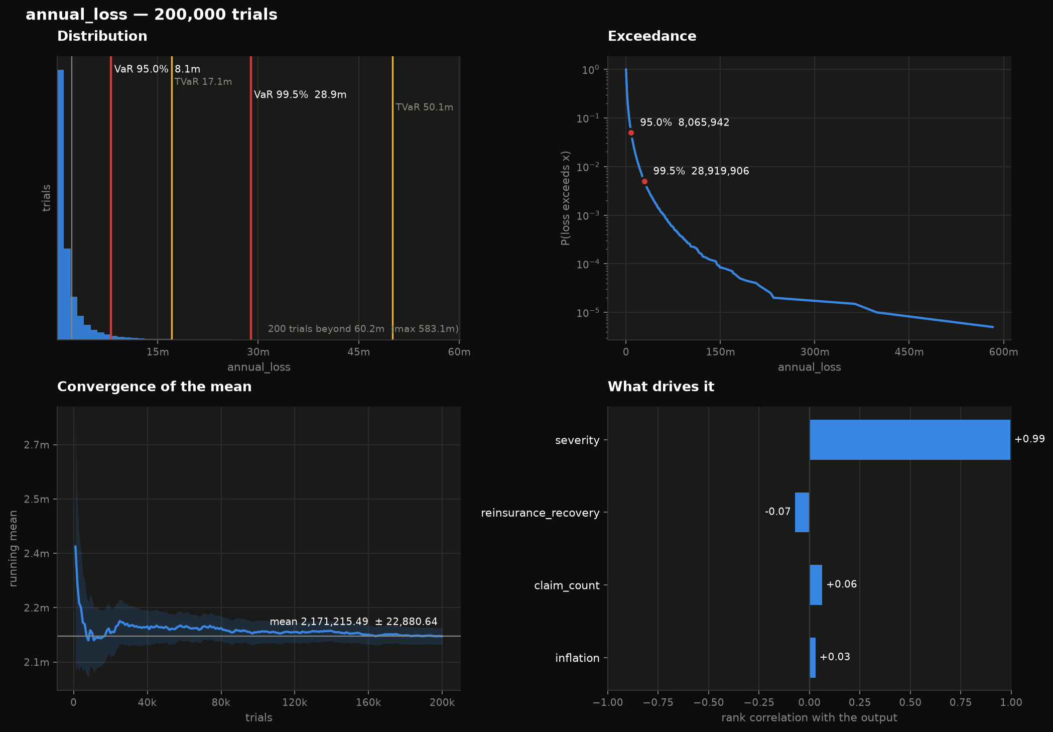
Where is the risk?
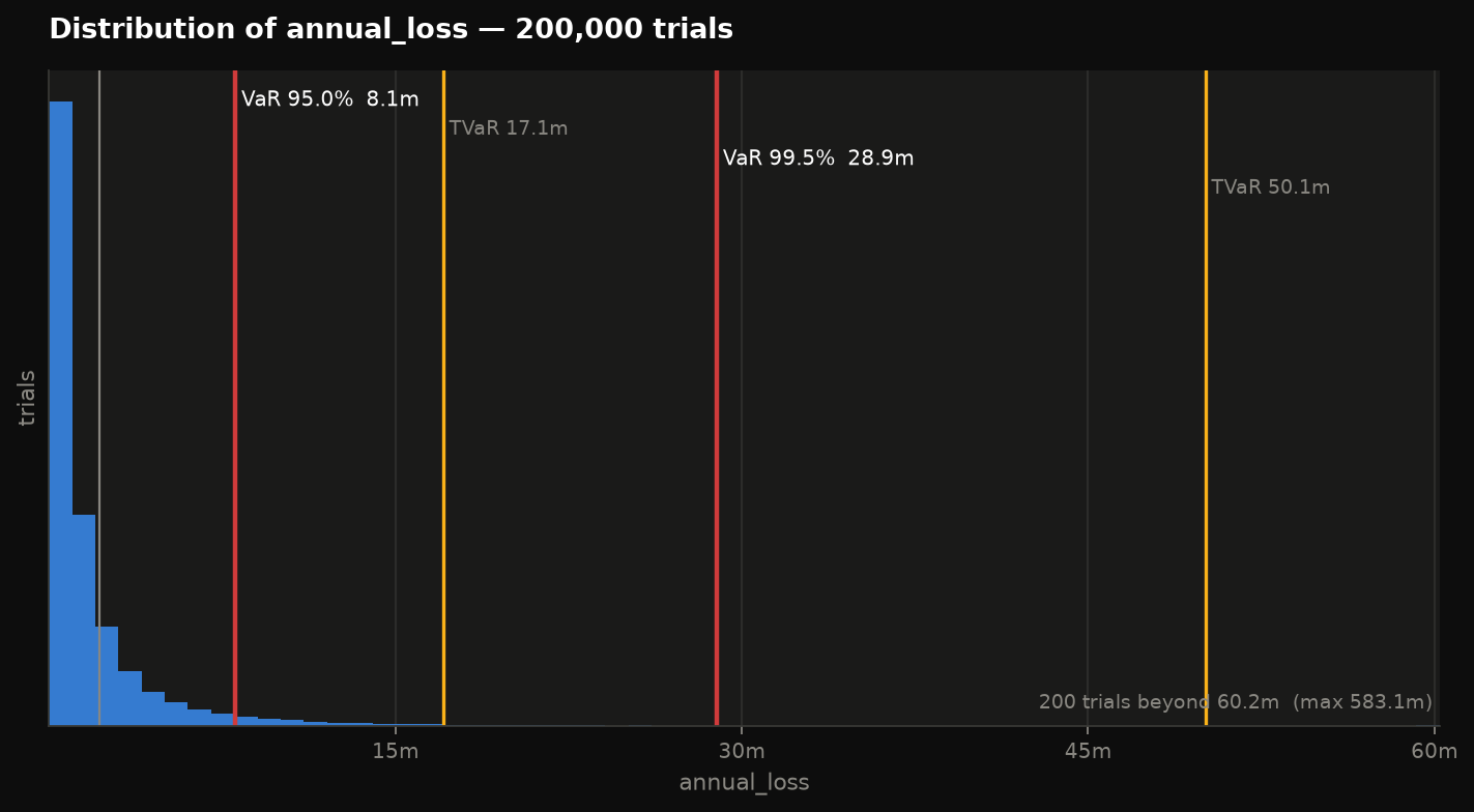
Histogram with VaR and TVaR marked at each level you ask for. The shape tells the story; the rules are what anyone acts on. The axis is clipped at the 99.9th percentile by default — a loss distribution is heavy-tailed by nature, and drawn to its maximum every other trial lands in the first bin — with the trials past the edge counted in a note rather than dropped.
viz.density(result) is the same question smoothed, for when the histogram
bins are doing the arguing; viz.cdf(result) reads a probability off
directly.
How likely is something worse?
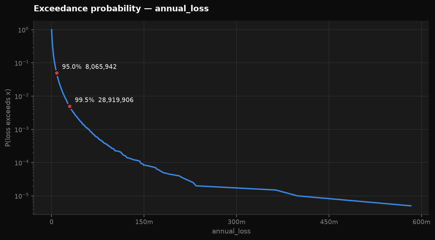
P(loss > x) plotted against x. Far easier to read off than a histogram tail, and the natural chart for a reinsurance conversation. Log scale by default, because every interesting probability here is near zero.
Did I run enough trials?
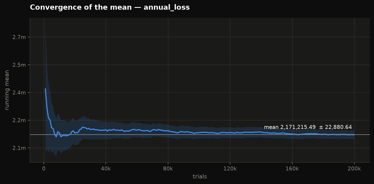
Running mean with a 95% band. If the band is still narrowing at the right-hand edge, run more trials.
What is driving it?
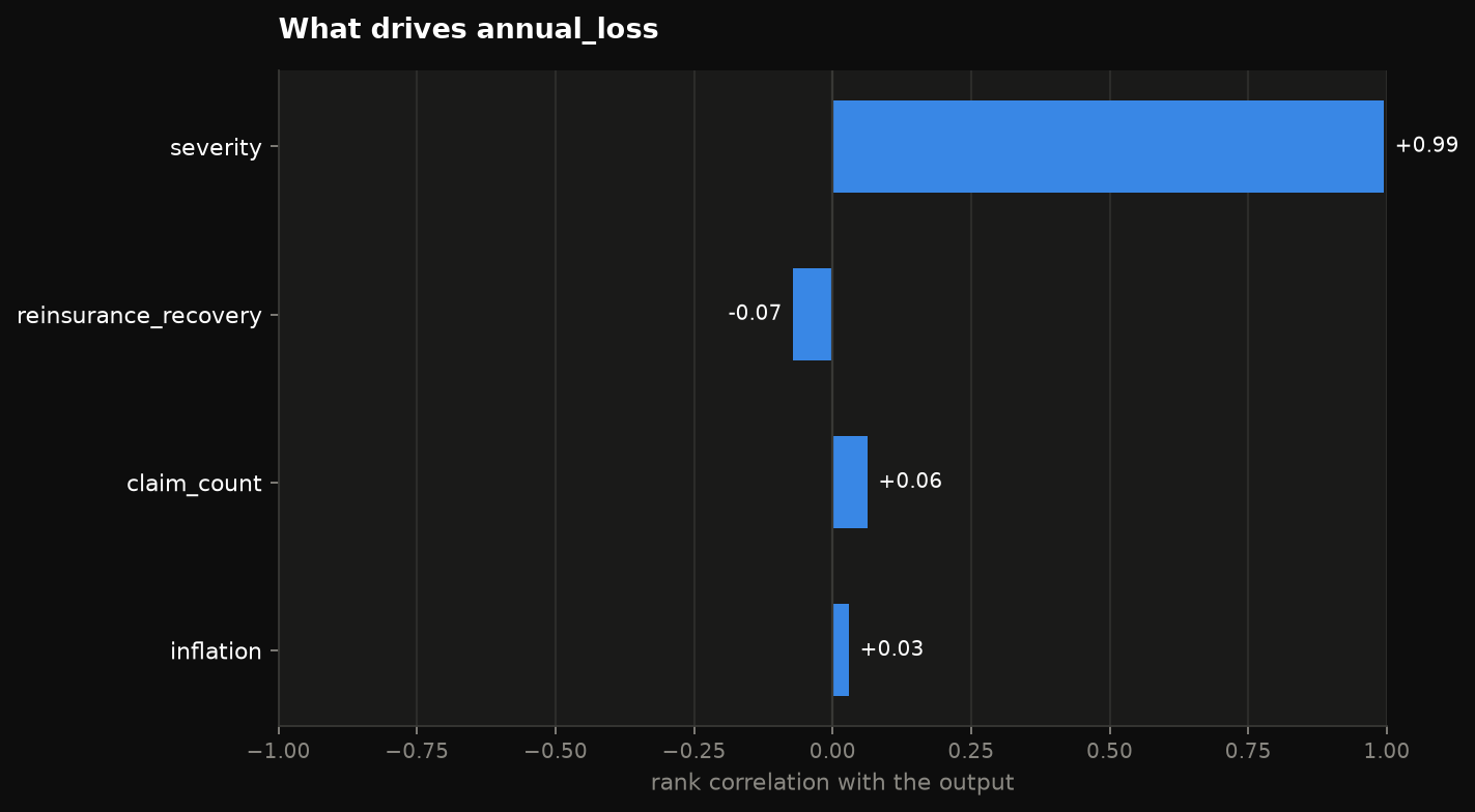
Rank correlation of each input with the output, strongest first, signed. Every bar is the same colour on purpose — the length already encodes the magnitude, and tinting by size would say it twice while burning the only free channel.
Does the distribution fit?
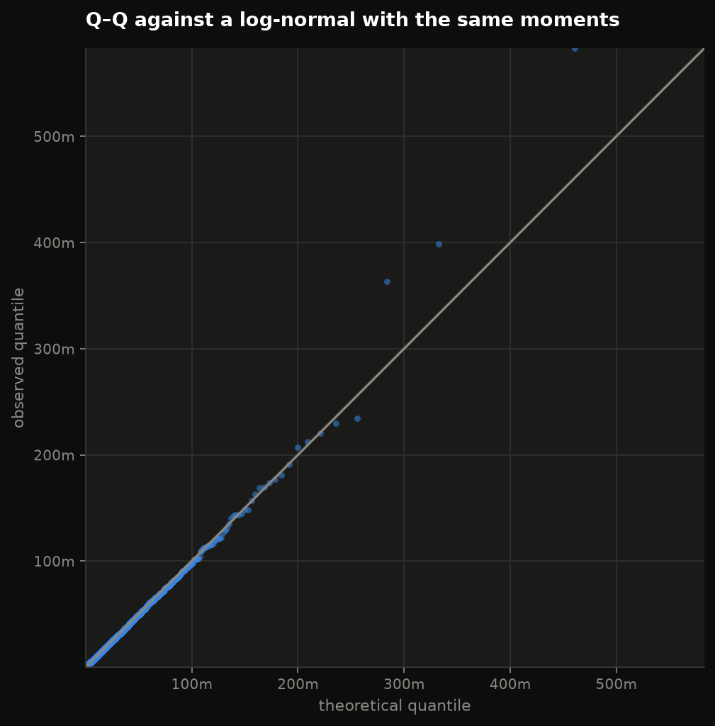
Points on the line mean the distribution fits. The informative part is always the ends.
All of it at once
Comparison
viz.compare({"no cover": baseline, "quota share 15%": quota, "negotiated": negotiated})
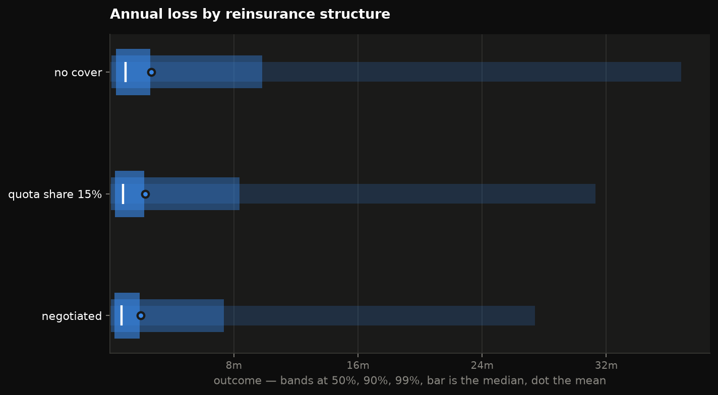
viz.spread({...})
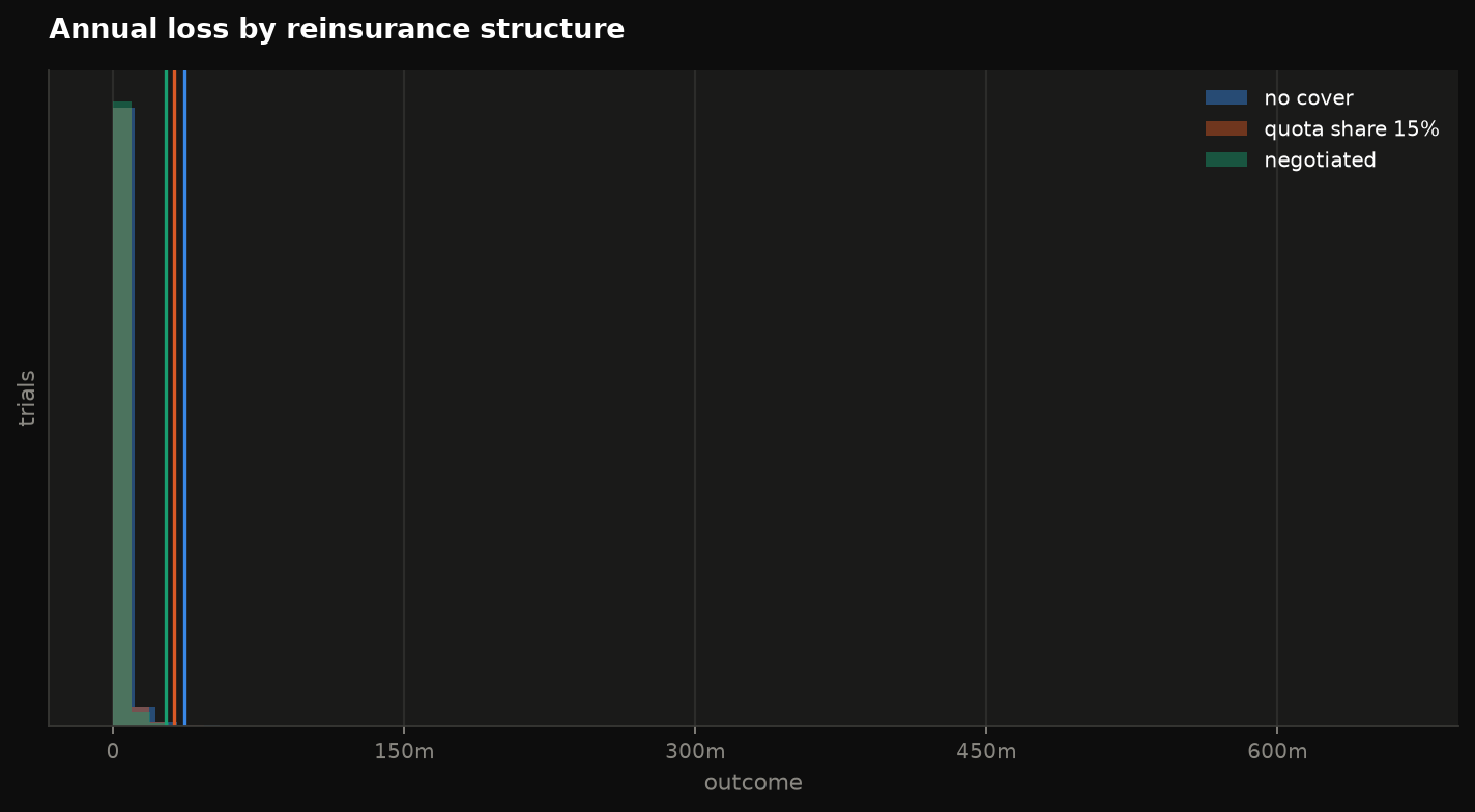
compare overlays histograms — one colour per scenario, always a legend, and
past eight scenarios it raises rather than inventing a ninth hue. spread
draws nested quantile ranges per scenario instead, and stays readable for
dozens.
Paths
paths = quant.gbm_paths(S0=100, mu=0.07, sigma=0.22, T=1.0, trials=20_000)
viz.fan(paths, levels=(0.5, 0.8, 0.95), ylabel="price")
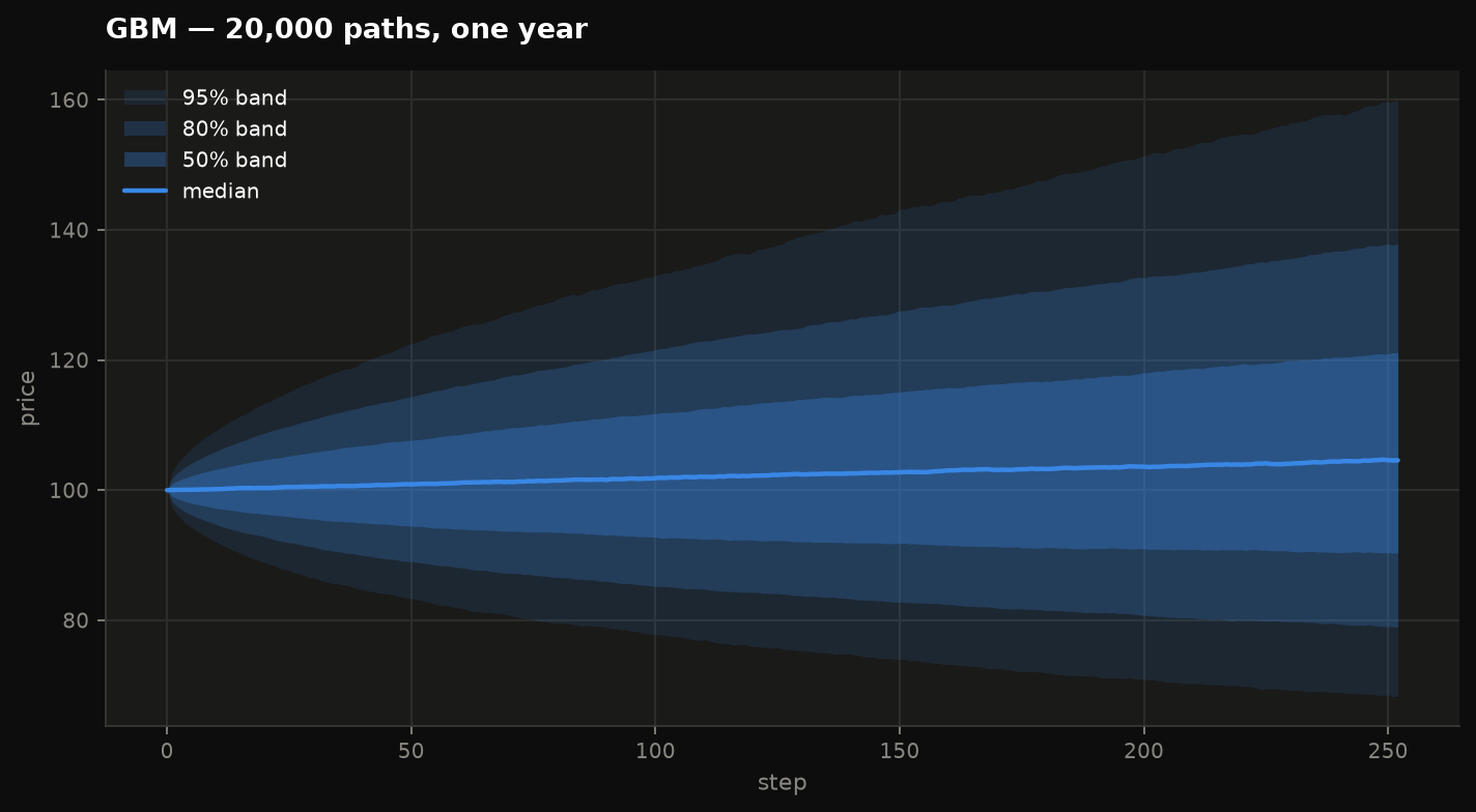
Nested percentile bands with the median as a line. Twenty thousand spaghetti
lines communicate nothing; three bands communicate the distribution. paths
is any (trials, steps) array, so this works for reserve run-off and rate
paths as well as prices.
Dependence
viz.correlation(result)                      # Spearman matrix of the sampled inputs
viz.scatter(result, "claim_count", "inflation")
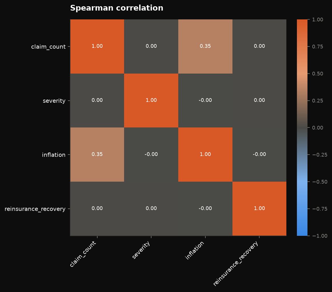
The matrix is on a diverging scale with a neutral midpoint — zero has to read as nothing — and every cell carries its number, because nobody can read a value off a colour ramp to better than a decimal.
Reserving
viz.triangle(tri)                        # link ratios as a heatmap; kind="cumulative" for amounts
viz.development(chain_ladder_result)     # each origin to ultimate, projection dashed
viz.reserve_range(mack_result)           # reserve by origin ± standard error
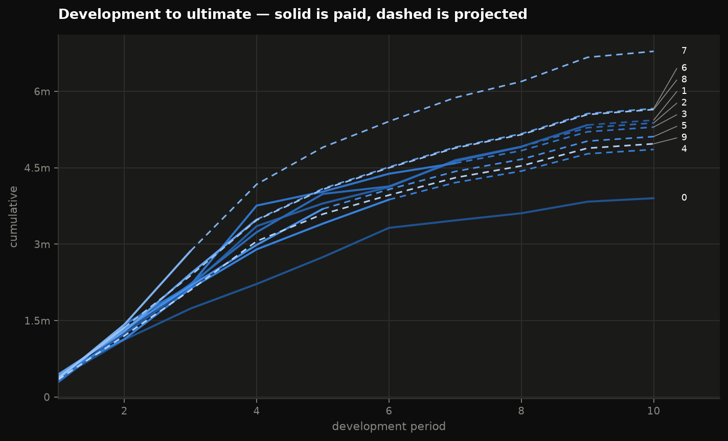
Dashing is doing real work in the development chart: it separates what has been paid from what the factors project, which is the one distinction a reserving chart has to make.
Life
viz.survival(table)          # l_x
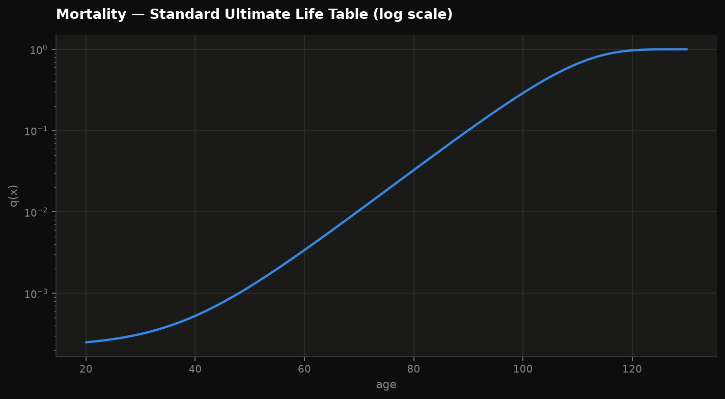
viz.mortality(table)         # q_x on a log axis, where Gompertz is a straight line
viz.reserve_profile(profile) # a policy reserve over its life
Rates and capital
viz.curve(yield_curve)                   # zero and one-year forward rates
viz.allocation({"Motor": 41.2e6, ...})   # capital by unit, shares labelled
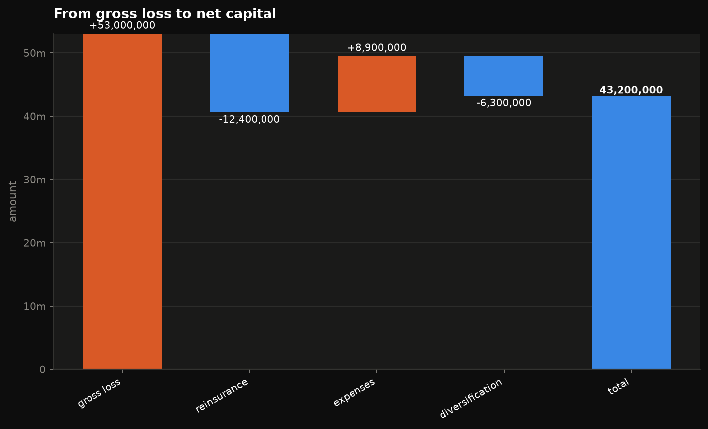
viz.waterfall({"gross": 53e6, "reinsurance": -12.4e6, ...})
Theme
Dark by default, because that is the surface the charts were designed against.
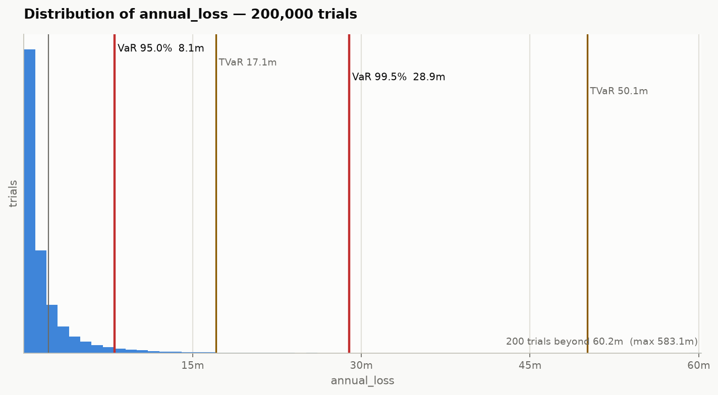
Both palettes are validated with the six checks a categorical palette has to
pass: every series colour clears 3:1 contrast against its own background, the
lightness band and chroma floor hold, and adjacent slots stay separable under
protanopia, deuteranopia and tritanopia. viz.PALETTE holds both, plus the
sequential and diverging ramps, if you want to match other charts to them.
The verification suite recomputes the contrast claim on every run.
Rules worth not undoing by accident
These are choices, not defaults, and each one is easy to break without noticing:
- Single-series charts use a single hue. Colouring bars by height double-encodes what the length already says.
- Direction never rests on colour alone. Signed values ship with a sign and a marker, so the chart survives greyscale printing and colour blindness.
- No dual axes. Two quantities of different scale get two charts, or index both to a common base. A second y-scale invents a correlation that is not in the data.
- Gridlines are solid hairlines. Dashed grid reads as a threshold when it is just a grid.
- Sequential means one hue, light to dark; diverging means two opposed hues and a neutral grey midpoint. Never a rainbow.
- Nothing is gated behind a tooltip. Every value is reachable as text.
Saving
In a headless environment — CI, a server — select the Agg backend before importing:
Every chart on this site is produced by
docs/generate_gallery.py,
which runs on each docs build. It is the most complete worked example in the
repository.